
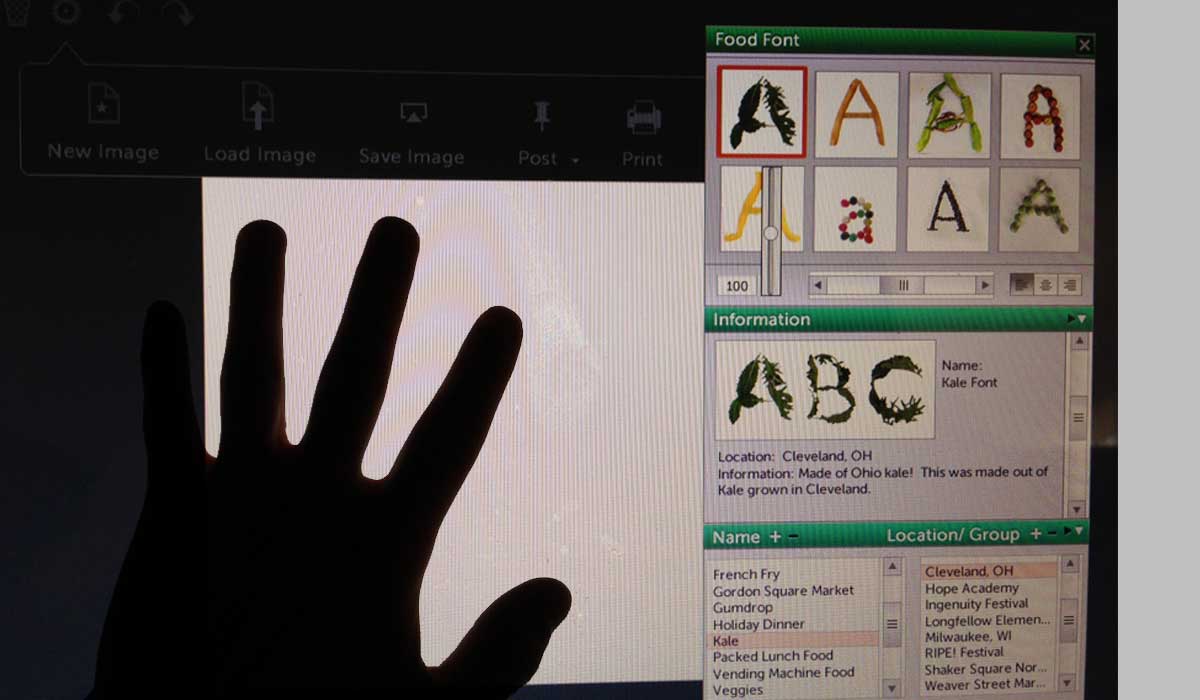
One of the challenges of designing a tool like the Food Font Design tool is that it is made for a wide range of people who will use the tool. The buttons and interface need to be intuitive, useful, and accessible for children and adults. The buttons and menus have to work with devices that we are familiar with or are easily learned. Things have to be large enough, but not too big.
Part of the process of developing digital tools is doing “QA” or the quality assurance process. This is a process of monitoring and improving the development process, making sure that any agreed-upon standards and procedures are followed, and ensuring that problems are found and dealt with.
Last weekend I was able to sit down with my 11 year old nephew, who gave me great input on the current interface designs. He has extensive experience for his age in using computers, doing research, and also using programs like Microsoft Word to create documents and posters.
He gave good feedback on panels, buttons, and functionality. H also gave some helpful suggestions of what was unclear or was missing in the current interface design.
Some of the suggestions he gave included:
-Adding a search for the backgrounds
-Making the search function in backgrounds and food fonts work like Google and have suggested text
-Adding a message for the Stamp tool to make it clear how it works
-Adding more options for Front/Back of objects (He suggested using the standard used in Microsoft Word)
-What quick keys are helpful and useful when highlighting and setting text
-What kind of shadows would be useful to use
It was great to get feedback on the interface, and I’d like to thank him for helping me out with the tool and being a great QA tester. (Thanks S.!)